Before going deep into how the mobile-first index will change the SEO landscape, recall why this happened in the first place. The entire business of Google floats around getting people on the websites that cater to their needs. Mobile-first indexing prefers the mobile version of your websites for indexing. Read on the ultimate guide to mobile-first indexing and its many facets.
Earlier Google indexing was based on desktop searches as it accounted for most of the searches made around. Lately, with the mobile revolution, that scenario has changed. People started searching, shopping, and browsing on their smartphones and tablets. And with the increase in mobile searches, Google is capturing the growing user base.
Guide to Mobile First Indexing in 2020: Key Takeaways
Currently, we are hearing a lot of buzz about Mobile First Indexing (MFI). The obvious reason is that Google is now moving toward the final implementation of the idea to make the web more mobile-friendly. However, marketers have multiple questions about Mobile First Indexing that they need answers to. The article is a quick compilation of some of those quirky yet significant questions and their straightforward answers.
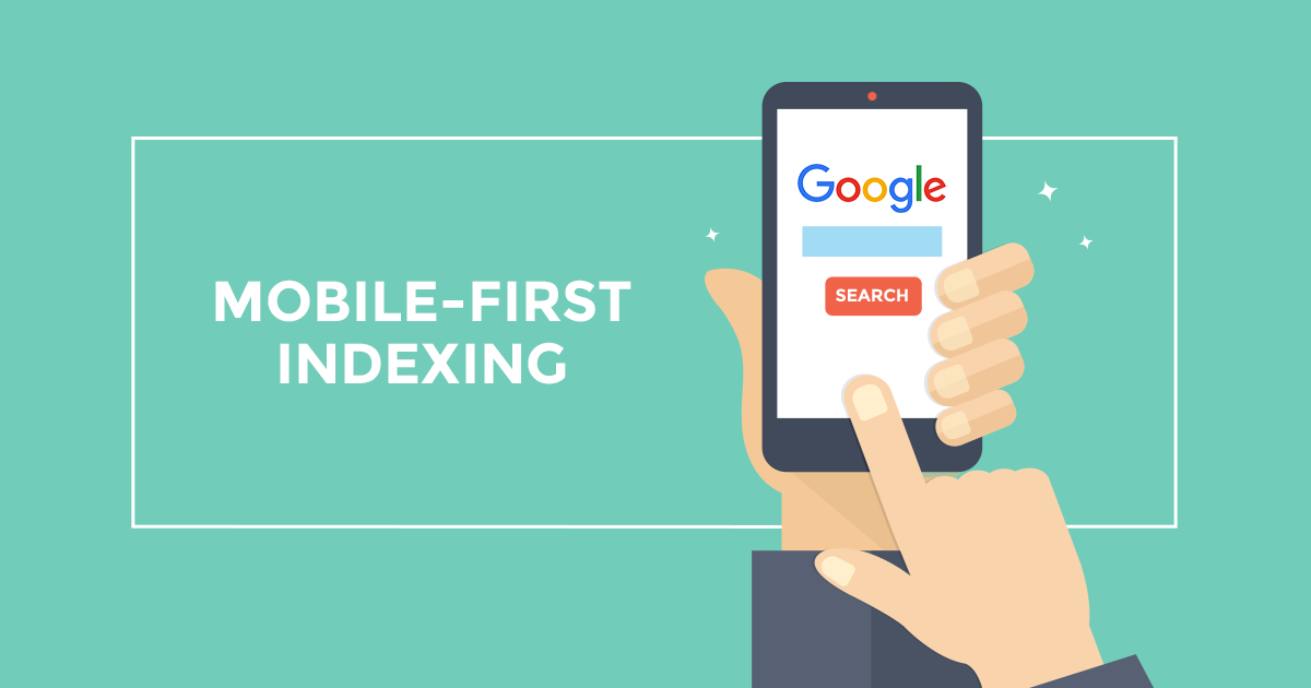
What is Mobile-First Indexing?
As the name implies, it’s a process of giving preference to the mobile version of a website in Google Index. That means, with Mobile-first indexing, Google is now making a mobile version of your website a priority for indexing, and search rankings. Lately, if you have monitored your traffic metric, there are two things to notice- one, a spike in traffic from Smartphone Googlebot, and two, more pages from the mobile version in the cached page repository.
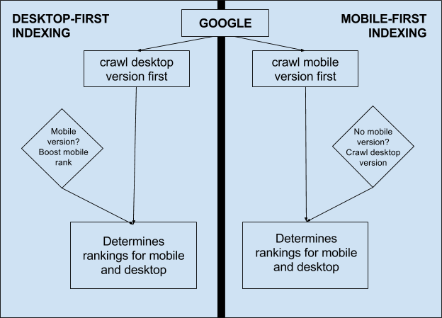
Don’t confuse Mobile-first with Mobile-only. If your website doesn’t have a mobile version, Google will keep including your desktop version of the website in the index. However, not having a mobile-friendly website could hurt user experience and can eventually lead to a ranking drop. Do note that sites that offer better mobile experience would potentially receive a rankings boost.
“Mobile-First” literally indicates that from now onward Google will be considering a mobile website as the primary version of your website. Therefore, if both of your websites (desktop and mobile) are you’ve optimized well and if you use responsive design, MFI won’t have any significant impact in terms of your site’s performance in search results.
Mobile-first Indexing: Key Website Elements to Look Into
The first and foremost thing to do: Don’t get in panic mode, stay calm. As of now, Google is in the early phase of testing the change with websites that the search engine giant considers being “ready” for this change. In Google’s latest Mobile-first rulebook, it’s said that you needn’t do anything to comply with the change if a website is responsive or has identical desktop and mobile versions.
If you have a separate mobile site, you must check the following components to see if they comply with Google’s latest guidelines.
Content:
If you have a separate mobile site, make sure it has all the high-quality, valuable content (text, videos and images) that’s available on your desktop site. You should also make sure that the content format used on the mobile version is crawlable and indexable.
Structured data:
You should also ensure that the structured data markup on both the mobile and desktop versions of the sites is the same. URLs being shown within the structured data on mobile pages must be the mobile version of the URL. Don’t add vague unnecessary structured data if it isn’t needed or irrelevant.
Metadata:
To be in line with Google guidelines, you may still want to optimize your mobile titles for shorter character counts. However, make sure that the information is the same and keywords are relevant.
Hreflang:
In case you’re using rel=hreflang for internationalization, make sure your mobile URLs' hreflang annotations are pointing to the mobile version of your country or language variants, and similarly, your desktop URLs should point to the desktop versions.
Social Metadata:
If you’re using OpenGraph tags, Twitter cards, and other social metadata, use them on both mobile and desktop versions of the website.
XML and Media Sitemaps:
Make sure that all the sitemap links are accessible from the mobile version of the site. This includes trust signals, like links to your privacy policy page as well.
Search Console Verification:
If you haven’t yet verified your mobile website in Google Search Console, add and verify it ASAP.
Mobile-first Indexing: Key Aspects
1. Mobile-first Indexing doesn’t create a separate mobile index.
To note, changing to mobile-first indexing neither generates a fresh index nor creates a separate mobile index. It only alters the Google adds content to the existing index.
2. The change is being tested and will take time for complete rollout.
As stated, Google has been testing this with a select group of sites which the search engine found ready for the rollout on their end. Even Google once made that it will probably take a few years to switch to mobile-only indexing mode.
3. Mobile-first Index won’t be the only ranking signal.
The mobile-first index doesn’t necessarily mean that it would be the only signal to determine rankings. There would still be occasions when Google will consider desktop versions of websites.
That would be in case you if don’t have a mobile version of a page. Since Google hasn’t yet rolled the change completely, you should track both the mobile and desktop rankings of your website.
4. Not having a mobile version would affect your site.
Unless the change comes into effect, your pages will be indexed as usual. However, if your website doesn’t have a mobile version or your desktop version is not mobile-friendly, you may not rank as well in comparison to mobile-friendly websites.
This may even negatively impact your overall rankings on desktop search as well as mobile search results because it will be perceived as having a poorer user experience than other sites (since the crawler will be a “mobile” crawler).
5. If you’ve got a responsive site, it’s fine.
It’s all about offering clutter clutter-free user experience. Google believes that if you have a fully responsive site, you shouldn’t be worried about anything as you already have your desktop content available on your responsive site. All you need to ensure is that you consistently manage to offer a well-optimized mobile experience in terms of page speed, load time and navigation.
How To Plan SEO With Mobile-First Index In Mind?
SEOs have the firm belief that mobile-first index will be a game changer. It will sooner become a force to decide your website’s ranking, authority, and content relevancy. Google has already made it clear in their webmaster blog.
“Although our search index will continue to be a single index of websites and apps, our algorithms will eventually primarily use the mobile version of a site’s content to rank pages from that site, to understand structured data, and to show snippets from those pages in our results.”
Let’s discuss how you can search and optimize your website amid a Mobile First Index roll out.
1. Run Google’s Mobile-Friendly Test
The first thing that you need to do is to check if your website pages are compatible with Google’s mobile-friendly guidelines. This you can check by running Google’s Mobile Friendly test tool. Start testing your pages one by one. You may choose your money pages first or those pages that you consider important. Ensure that your highest-selling pages or product pages are tested and then optimized for mobiles.
If you don’t have a mobile website, a responsive site or AMP pages, get it done faster before Google entirely rolls out the Mobile First Index. In case you are planning a new website, go for a responsive design. In addition, follow the same content and design structure both in desktop and mobile versions.
2. Check if the Website’s Mobile Pages are Indexed
If you forget to check whether the site’s mobile pages are being indexed or not, you might be losing big time. It’s easy to ensure the indexing status of your mobile pages. Enter “site: mywebsite.com” in the search bar and hit the enter button. If nothing comes up, maybe a Google bot is not able to access your mobile pages.
You can easily fix this mess. If you are using two separate websites, one for desktop and one for mobile, I would recommend you to create a mobile sitemap. It will help Google identify your mobile pages. Having a separate mobile site could be a reason if Google is not indexing your pages. You can also tag your mobile pages with rel=canonical and rel=alternate tags. When you finish it up, submit your mobile sitemap to Google search and add your mobile sitemap to your robots.txt
3. Check For Smartphone Errors in the Google Search Console
Your next step should be examining smartphone errors in the Google Search Console. The errors popping up in the search console will help you strategize your SEO. To check that errors in detail Go to Google Search Console -> Crawl Errors -> Smartphone Errors. Cleaning these smartphone errors will help you get your content indexed better.
4. Update Your Mobile Content
In case you have separate mobile and desktop websites, you may want to cross-check the content published on both sites. Most of the website owners tend to develop websites that are much lighter in content. This is because they want to keep the page speed faster. But as the new Mobile First Index is here, having different content on desktop and mobile can lead to major traffic and keyword loss.
If you have longer content pages on desktop than mobile or vice versa, a content audit is needed to find out which part of the content is important and which part can be removed without losing traffic. Your important pages are those that are getting traffic for certain keywords. Before starting migration or redesign, discuss a plan with the editorial team to migrate content without losing its value. To garner the best results out of the mobile-first index, you’ll need to decide what content you want to place on your mobile website.
5. Remove Hidden Content for Tabs
Though Google categorically mentioned time and again that they are fine with content in tabs, you should still double-check to ensure that content is visible to all users both on mobile and desktop devices. Web designers tend to hide content in tabs to make the design cleaner. From an SEO point of view, it’s important to watch for hidden content. Text, if available but not accessible to the users is against the Google guidelines. Call a meeting with the developer and ask him to ensure that all the content in the accordion or tabs is shown.
6. Launch Your AMP Pages
If you haven’t yet developed your mobile site, create AMP pages for the meeting with the developer and ask him to ensure that all the content in the accordion or tabs is shown. Google can index your AMP version of pages, even without a mobile-friendly version. Use the AMP testing tool to check if you have implemented the AMP pages properly and correctly. The tool will offer you important suggestions on how to fix your AMP pages.
7. Revisit Your Link Building Strategy
Post-mobile-first index era, Google is still confident about link’s importance to Search Engine Optimization. As per Google, the links will still be vital to your SEO success. Experts are of the thought that soon Google will transfer the weight of your links directed to the desktop over to the mobile-first indexing.

Tarun Gupta, CEO of Brainpulse Technologies, is a prolific author and digital marketing specialist. His insightful writings span SEO, content marketing, social media strategy, and email campaigns, offering invaluable expertise to businesses worldwide. Tarun’s contributions continue to shape the digital marketing landscape, guiding success in multiple niches.