Having a solid landing page for your website isn't everything, but you should also have a conversion strategy. After publishing your landing webpage, you must be asking a series pertinent questions to yourself about the conversion goals. The questions should be like:
- Are visitors clicking on the call-to-action button on the landing web page?
- Are they filling out your sign-up / subscription form on your landing page?
- How are they behaving towards your page?
- Are they reading from top to bottom or do they bounce off?
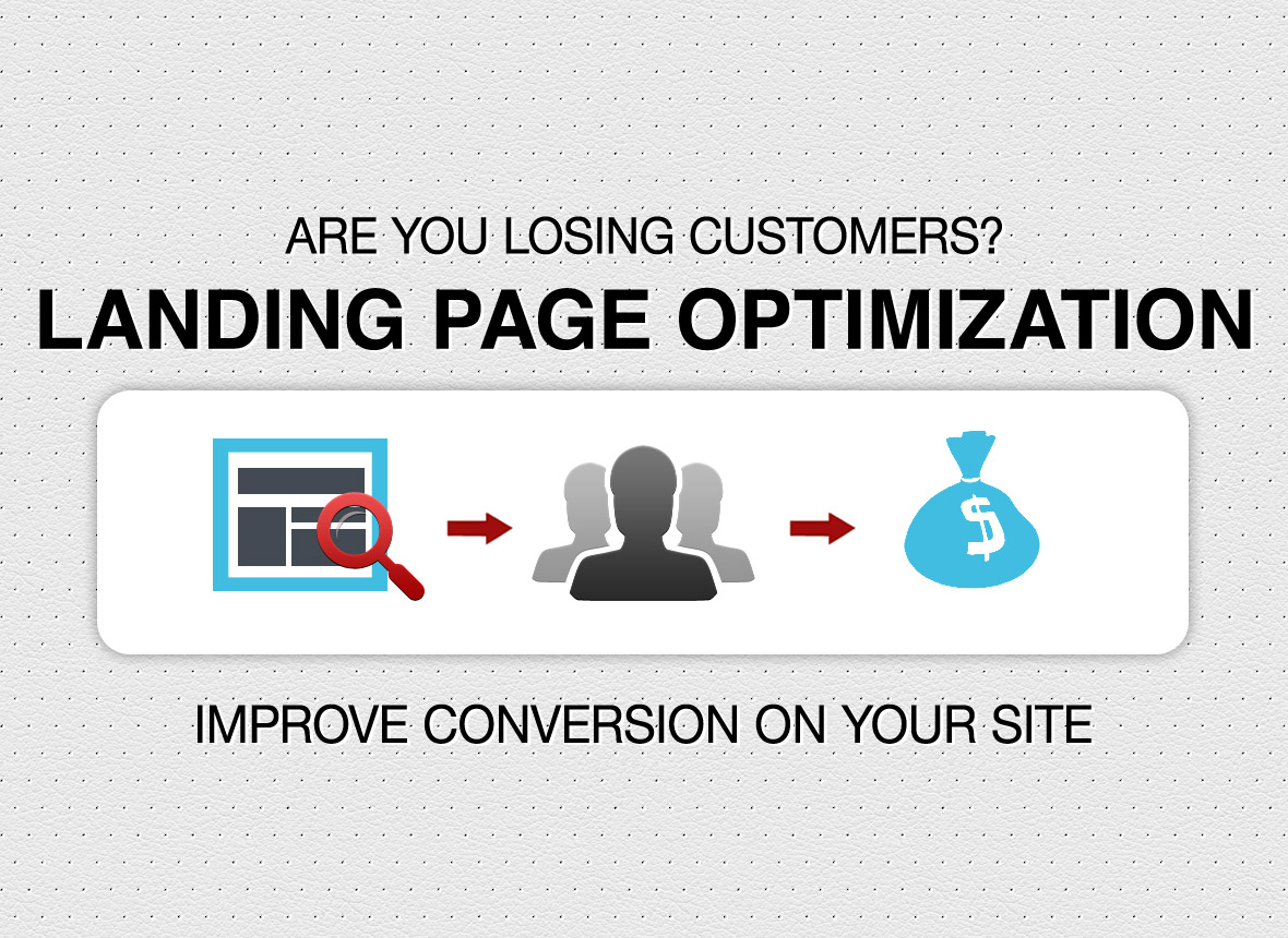
How to Create Landing Page that Converts
While planning and developing landing pages, these are the questions, marketers should outline first. There are different landing page factors exist that should be tested. Notably, they take much time to track, measure, and implement. In order to earn more customers and sign ups to your site, you need to organize and strengthen elements in your landing web page. The post explains how you can supercharge a product page for maximum user influx and conversion.
Tell a Story
A study made at Moz tells that a good landing page is one that able to increase the number of subscribers. The study emphasized the use of a long product page, that eventually against the K.I.S.S. (keep it simple, stupid) principle. The rule suggests and recommends a landing web page that keeps information compact and easy to understand. The idea of KISS doesn't necessarily apply to landing pages.
A landing web page should have organized so that it imminently flesh out information and convey message effectively to the audience. You should describe the product details on landing page so your audience will have a better understanding of what your offer is all about.
Use a Perfect Call to Action
Call-to-action on a landing page serves a number of purposes. It could be getting visitors involved in transactions or getting your subscribers to opt-in. An optimized and well-thought call to action requires should be distinct and clearly visible. Following are the factors that keep your call-to-action above the fold.
- Design:
- Color:
- Text:
Placement of your CTA on the landing page is crucial and integral part of your overall design strategy. It also helps boosting your conversion rate.
No rules have yet been defined for CTA color, yet you should go for the best colors for your landing pages to see your conversion rate fly high.
Though, they are the standard texts, its time to ditch “Download Now,” “Click Here,” and “Submit” from your CTA list. Frankly, there is no precise rule to the kind of CTA to be used for your page. I'll suggest you to conduct A/B testing for different versions of your CTA and see which works better than others.
Add Influencers
Social influences are about adding testimonials and positive product reviews on landing page for improved conversion. Consumers tend to buy the products that fellow buyers endorse. If products are backed with positive experiences of those who bought, it will influence and ease people’s doubts about the product. I have recently been to one landing page associated to an institute that offers coaching to aspiring engineering students.
A section of the landing page shows stories from different students who took coaching from the institute. Students have shared their positive experiences with the institute and faculty. Social proof of that extent appear much more functional and useful to visitors. Even if a visitor is not willing to buy product at the moment, testimonials and other forms of social proof result in a sale or sign-up.
Avoid Using Flash Images:
Adding big and eye-catching images to your new landing pages is a good idea. They make your website visually appealing. But heavy and unoptimized images play the spoilsport. While adding images to the posts or pages, don't forget to optimize or compress them. Heavy or flash based images may result in slowly loading pages and a poor user experience.
If your website loads slowly, potential customers exit before viewing any of the content. Using flash images may prohibit many mobile users from accessing your website. Notably, customers have a tendency to abandon a page within seconds if it doesn't load quickly.
Use Awesome Content
A successful websites is one that incorporates informative and unique that specifically target the audience. User centric and keyword rich content acts elixir for a website.
Though, a redesigned website enables you update relatively weaker content, yet you should be ready to migrate the content that already brings strong organic search traffic. Don't undermine the power of your existing content that's doing fairly well with your existing website. Migrating them to the new website would be equally beneficial.
Make the Page Crawalable
This is a fatal mistake that chokes your website's rankings and visibility. The mistake usually happens when websites are moved from the staging area to the live server. Developers use robots.txt to block search engine crawlers while they begin redesigning, but forgot to update the file when the site goes live.
Ensure Mobile Friendliness
As more and more people have started using their mobile devices for shopping and browsing, a mobile friendly website is a must. A year ago or so, Google launched Mobilegeddon, an algorithm that targeted at websites that didn't comply to mobile-friendliness and failed to render user experience.
When update triggered, mobile unfriendly websites witnessed mobile searches declined 12% in just the first two months. The crux is that if your website is focused primarily for laptop and PCs, you could lose rich traffic and revenue that come from mobile. Stop waiting for a disaster to happen. Mobile is the new world.
Include Opt in Form
Inviting people for subscribing newsletter / sign up / mailing list is a daunting task. Unless you offer them something of immediate value for free, you can't get them into your shoes. Opt-in bribes are rampant among the marketers who effort hard for list building campaigns. They offer irresistible opt-in offers that seems refreshing and valuable to the audience. They may be creative e-books, white papers, and cheat sheets. Prompt for a A/B test to find which opt-in offer converts better and gets more subscribers to your list.

Tarun Gupta, CEO of Brainpulse Technologies, is a prolific author and digital marketing specialist. His insightful writings span SEO, content marketing, social media strategy, and email campaigns, offering invaluable expertise to businesses worldwide. Tarun’s contributions continue to shape the digital marketing landscape, guiding success in multiple niches.
July 1st, 2016 at 4:25 pm
Thanks for the useful article I understand the importance of landing
pages for PPC or any specific campaigns. It will help me to make landing
page strategy for my PPC Project… Thanks !
July 2nd, 2016 at 3:16 pm
Also, using infographics in web contents increases user interest and hence better change for conversion.