Mobiles lately overpowered desktops and tablets in terms of user base. Beyond the standard mode of communication, now mobiles have become the primary source of information and browsing. It potentially pushed marketers to rethink their online visibility and expand its scope, specially around the mobile devices.
Now, consumers are more addicted to their smartphone for browsing and shopping. Therefore, you can't simply ignore them. Google, years back, drew a line with Mobilegeddon to assume assumed guidelines for websites. The algorithm stated rules for websites to deliver users extremely perfect user experience across the devices regardless of screen size. The algorithm warned websites of ranking drop and tanked website visibility if they fail to comply the guidelines.
The algorithm further helped Google to rope -in mobile-first index, Google's way to give mobile responsive websites preferential treatment in indexing. Notably, Desktops earlier were the first priority for indexing.
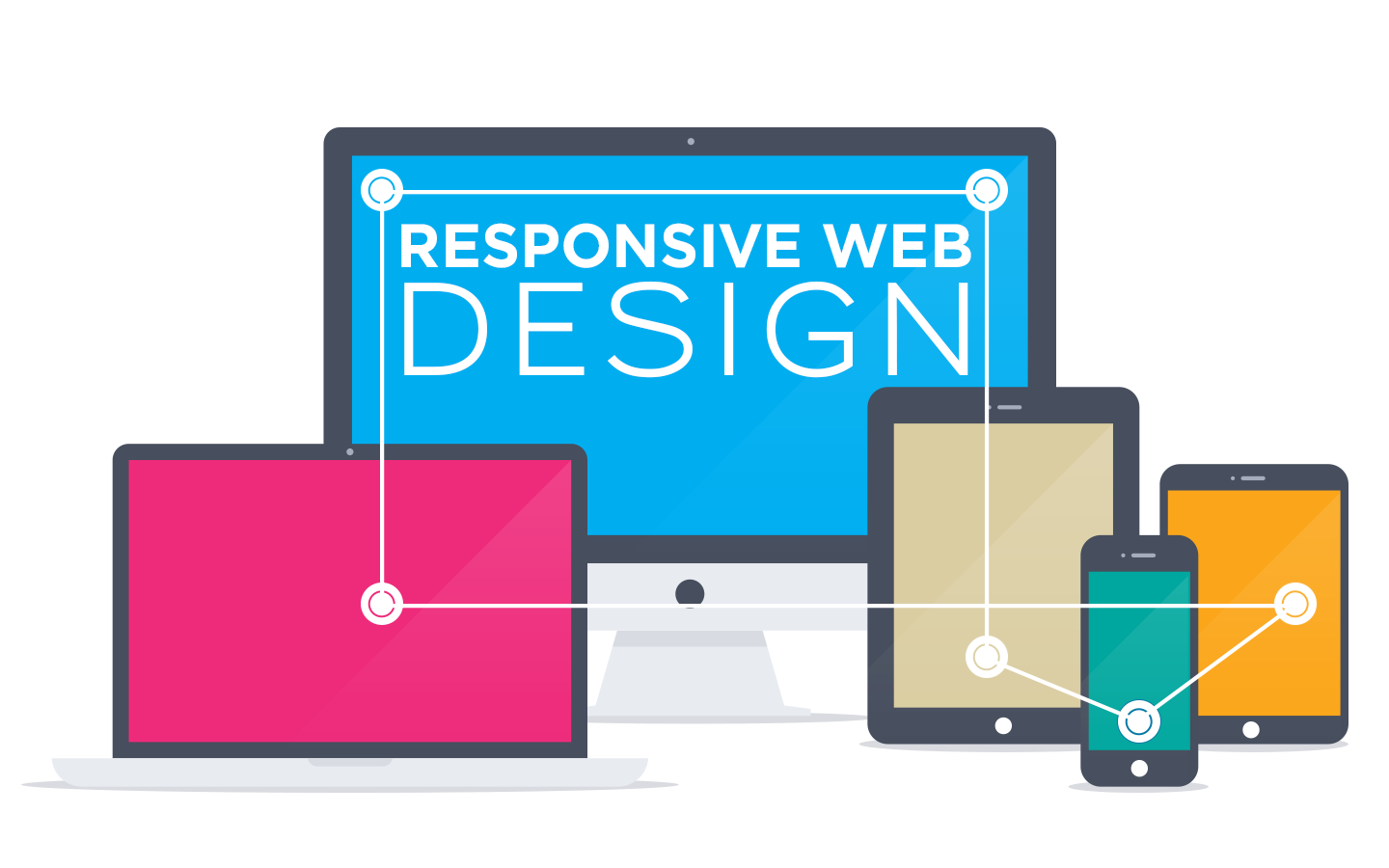
To survive the mobile-first indexing, your website should have a responsive version. To recall, a responsive website is designed in a way that manages to open on every device without clutter. When opened, responsive design websites adjust the screen space accordingly.
5 Ways Responsive Design Improves Search Rankings:
A responsive website has dual advantage to offer. One, to deliver maximum user experience, and two, help your website rank better in search rankings. Since Google loves websites that are optimized for people using mobile and smartphone devices, you can't afford to have a website without mobile responsive design.
If you're still clueless how responsive website could help in having improved search rankings, consider these 5 ways responsive websites may help your website rank better:
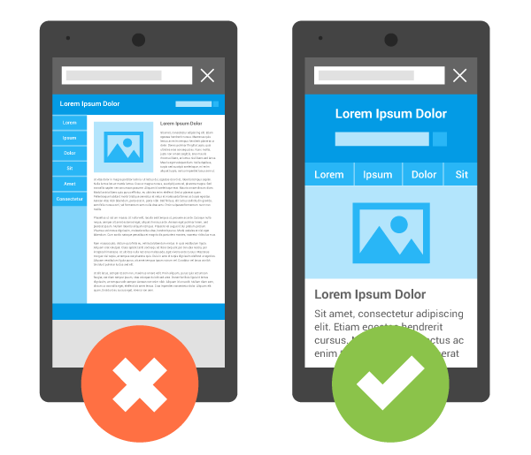
1. By Improving Site Usability:
Users are quick at making choices, and unless you offer them seamless user experience throughout the website, it's unlikely they will stick around. Google considers the time user spend on the page as a fundamental indicator of a site's value for any search term given.
Your search for responsive web designing experts ends at Brainpulse. We will help you launch future-ready responsive websites that give visitors consistent website browsing experience across the devices.
This is where responsive website helps. Websites with responsive design are easier for visitors to read and navigate. This eventually leads to improved user experience and a greater time spend by your user on the site.
Increased visibility further ensures more visitors and increased conversions. Responsive websites deliver positive user experience, traffic, positive reviews and rise in branded searches. All of these metrics impact ranking.
2. By Improving Page Load Time :
It's now a proven fact- page load speed is an important ranking factor.
Marketers should optimize their websites for page speed. Quicker a web page loads, better the user experience it delivers. Google has been very consistent in favoring fast-loading sites in search results.
Responsive websites load quickly, therefore, they result in a more positive user experience as well as a likely boost in ranking.
3. By Reducing Bounce Rate:
Bounce rate is an important indicator of a website's worth. The term indicates how quickly do your visitors leave your website? Google pays attention to bounce rate.
As per Google- Increased bounce rate on your website indicates that users leave your site almost as quickly as they arrive to it. This is a clear signal that your content isn't relevant to what users searched for.
If you fail to keep check on bounce rates, your site rankings in the SERPs could fall.
With a mobile friendly responsive website, you mostly accommodate the finest piece of content for your readers. Due to space constraint and other factors in place, you usually put limited yet important content on display.
Crisp and relevant content engages your readers and compel them to stick around longer. This considerably decrease the bounce rate, and thus, your website's search rankings.
4. By Reducing Duplicate Content Issues:
If you choose to go with a separate mobile site besides the regular one, duplicate content issues will give you nightmares. Despite using different URLs for both mobile and desktop websites, the content on both the URLs are same.
This duplicity of content can seriously harm your rankings. Most mobile websites don't rank well in search engines as they are canonicalized to their desktop counterparts.
Websites with responsive design can easily deal with duplicate content as irrespective of the device it runs, its URLs and page content are remain unchanged. Whether you open the website on a smartphone or on a tablet device, you needn't to change the URL to view the content.
5. By Improving Reach therefore Social Sharing:
Online businesses are now very much dependent on mobile ecosystem. Means, a huge crowd of mobile users are waiting to pursue your content on their device(s).
Want a website designed to promote your brand or services on the web? Brainpulse web designing service will help you.
Although, social sharing doesn't have any direct impact on search rankings, but it can help grow your audience exponentially.
Bigger audience base can increase traffic and engagement as well as your brand value. More the reach your website gains, more the likes, shares and recommendations it achieves. Eventually Google takes strong note of these signals and keep your website in its good books.

Tarun Gupta, CEO of Brainpulse Technologies, is a prolific author and digital marketing specialist. His insightful writings span SEO, content marketing, social media strategy, and email campaigns, offering invaluable expertise to businesses worldwide. Tarun’s contributions continue to shape the digital marketing landscape, guiding success in multiple niches.